Last week I was invited by a former co-worker - our retired school art teacher - to join a creative facebook group she was also joining facilitated by Dar James, an artist and illustrator that she knows. I've been following Dar on FB for a few years and tune in to her live FB sessions when I get a chance (or remember). With the constraints of the pandemic, she has had to curtail her in studio classes - something that my friend had also wanted me to be part of and I was looking forward to - so this makes for a good starting point, I think. She's going to give us a prompt each week and encourages us to make ATC's - Artist Trading Cards - as our "homework". If you're not familiar, the size is 2 1/2 x 3 1/2 inches for an ATC.
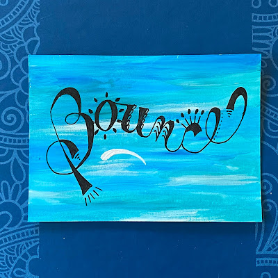
The first week prompt was "Thick and Thin" - to use thick and thin lines in our creation. I had made a similar card to this several years ago which was hanging on our refrigerator, but it the ink I used was fading so I decided to give it a try with gouache this time. The thick and thin lines at the bottom represent the thick ending in thin grass stalks.
The second one I did for this prompt was to "illustrate" my word of the year. You can see the thick and thin strokes in the lettering.

The second week of prompts was based on the new Pantone colors of Gray and Yellow, and taking inspiration from this Tarot card she provided. With this one, she encouraged us to use the colors red, yellow, and blue (in shades of our choice) to create gray. There was a FB session that went along with that. What do you think of this year's colors? I remember as a young mother in the 80's one of my favorite everyday outfits was a pair of soft gray corduroy pants, a yellow turtleneck sweater, with a hand crocheted gray vest. I think I still have the vest. I also remember that I made pillows in shades of gray and yellow for Rachel's bedroom in her condo after she graduated UD in the 2000's. And most recently, well about four years ago, they finally found some money to let us "paint" the school office and we chose yellow to go with the light gray counter tops and door trim. I also remember that the opinions on the office were quite polarized.

So I think you will be able to see the clouds and snake in this first one.
And that center symbol in this one.
This one I did because the day I did it was actually National Polka Dot Day and I wanted to give some time to the polka dots. I added a die cut flower ring over one of those dots.
And yes, all my grays were made by mixing magenta, yellow, and turquoise.
I'm looking forward to doing more of these. If you're interested in joining this group let me know and I'll send you an invite.


Lovely interpretations of the themes Lorraine.
ReplyDelete